Monday, August 31, 2009

Gauguin + Eiffel Tower


The following anecdote won't be as funny if I have to explain it. Hopefully you know/can surmise enough about architectural symbolism and Gauguin's personality/lifestyle to see the humor.

This is more-or-less an excerpt from tonight's dinner conversation:

M: So, I read this case study about the Eiffel Tower and modernity today, and I was surprised to find that Gauguin commented about the tower at the time of the 1889 exhibition. He said that he was impressed with the tower's...

J: [Interrupts] ...virility?

M: [Chokes on spaghetti while laughing] Ha ha ha!
[Recovers and clears throat] No.

J: [Chuckling and looking pleased about his clever remark] Then what did he say?

M: Gauguin admired the technical modernity of the tower; he called it a "triumph of iron."1 I am always surprised at how Gauguin really embraced modern life. On one hand, he wanted to be "primitive" and earthy by living in Tahiti and being a "savage," but really, at same time he loved modern life. It seems like he really embraced primitivism because it was the modern, avant-garde thing to do. He didn't want to be primitive because he wanted to get away from modern life - he wanted to embrace modernity by being primitive.2

---Don't you wish you ate dinner at our house? Then you could choke on spaghetti too. Don't get your hopes up too much though, because footnotes aren't included in our actual dinner conversations.

1 Gauguin admired the technical modernity of the tower, but he did think that the tower was designed with outdated decorative forms. This is the the full quote: "This exhibition represents the triumph of iron; not only regarding machines but also architecture. Though architecture is in its infancy, in that, as an art it lacks a sense of decoration proper to its own materials. Why, alongside this iron, so rugged and strong, is there trivial terracotta decoration? Why, next to these geometric lines or a wholly new character, this ancient stock of old ornament?" See Paul Wood, ed., The Challenge of the Avant-Garde (New Haven: Yale University Press, 1999), 159.

2 During graduate school, I wrote a paper about how Gauguin was in a state of denial regarding his savage, primitive lifestyle in Tahiti. Even though Gauguin renounced modern civilization and claimed to be a "barbarian" in his writings, in actuality he couldn't part with modern life. For example, he was almost entirely reliant on tinned foods from the trading store in the area; he couldn't even bring himself to eat the native food! In addition, Gauguin frequently used oil paint when creating his art - a medium which not only is European, but also is closely tied to the art market, commodofication, and avant-gardism. In my opinion, Gauguin was "primitive" because it was the hip (ahem, "modern") thing to do. Gauguin's 1889 reaction to the Eiffel Tower solidifies my opinion that the artist was not leaning away from modern life before going to Tahiti (he arrived there in 1891), but leaning towards it.

Saturday, August 29, 2009

Pronunciation of Dutch Masters' Names

If you want to learn how to pronounce the names of Dutch masters correctly, click here. "Peter de Hooch" makes a more gutteral sound than I originally thought.

Friday, August 28, 2009

Intro to Architecture: Greek Capitals


Someone requested that I write a few introductory posts on architecture, and I am more than happy to comply! I thought that it would be fun to start with the architectural orders that were popular in ancient Greece. (I thought about waiting to write this post until I reached this same chronological point in my intro/survey posts, but I'm too excited to wait. So, sorry for the anachronism. Just pretend that the architectural posts are separate from the other survey posts.)

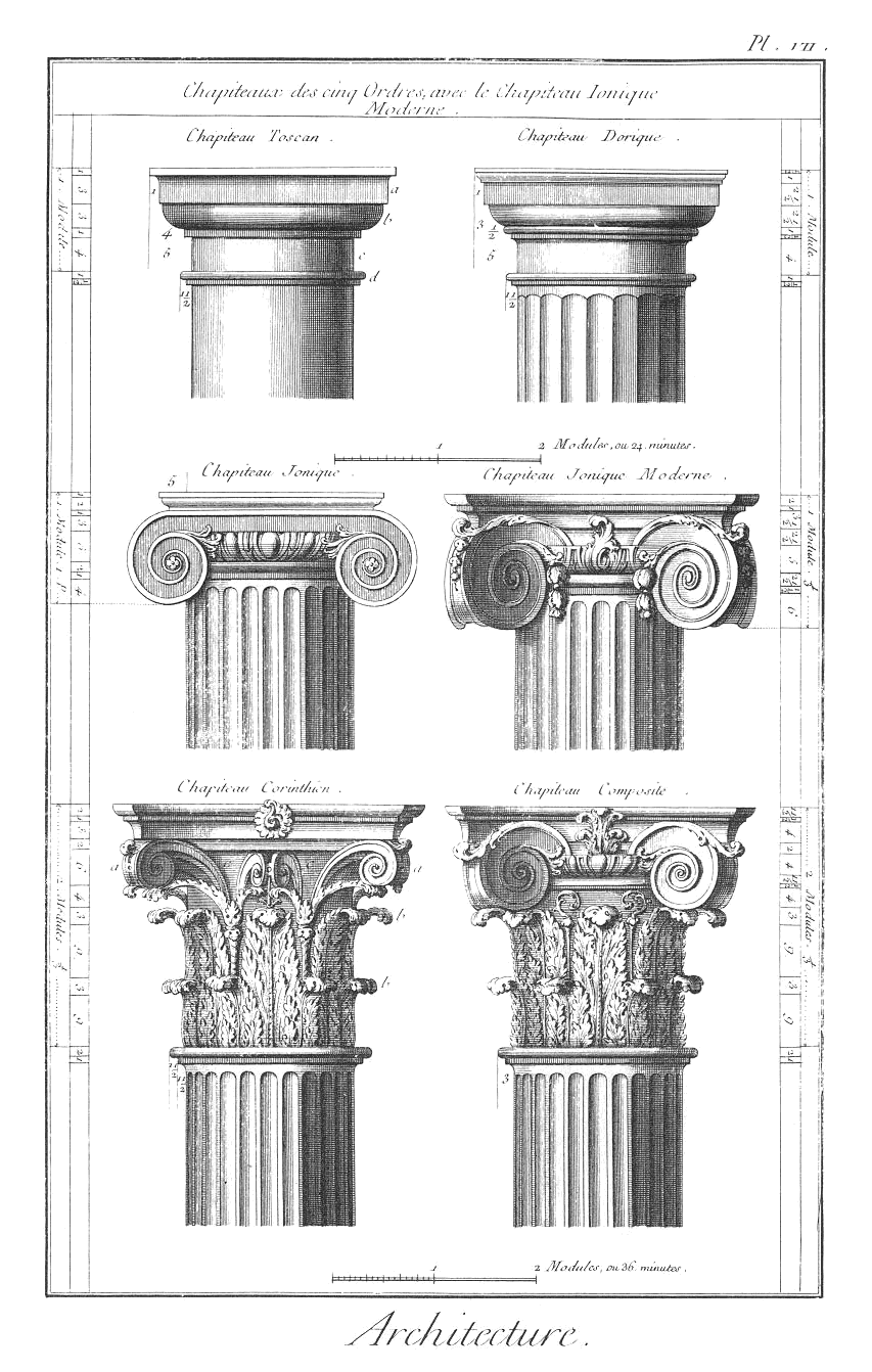
The three Greek architectural orders are called Doric, Ionic, and Corinthian. These orders are easily defined by a key characteristics, namely the capitals (decorative heads) at the tops of the columns. There are several other architectural features which define these three orders (and there also are variants within these orders, as you can see in the drawing on the right), but I don't want to overwhelm anyone. For now, we'll just focus on the capitals of these basic columns.

As you can see from the pictures above, the Doric capital essentially is split into two simple sections. In contrast, the Ionic capital is decorated with large volute scrolls and the ornate Corinthian capital is decorated with acanthus leaves and scrolls. If you want to see some other examples of these capitals (and some other awesome capitals in general), click here and here.

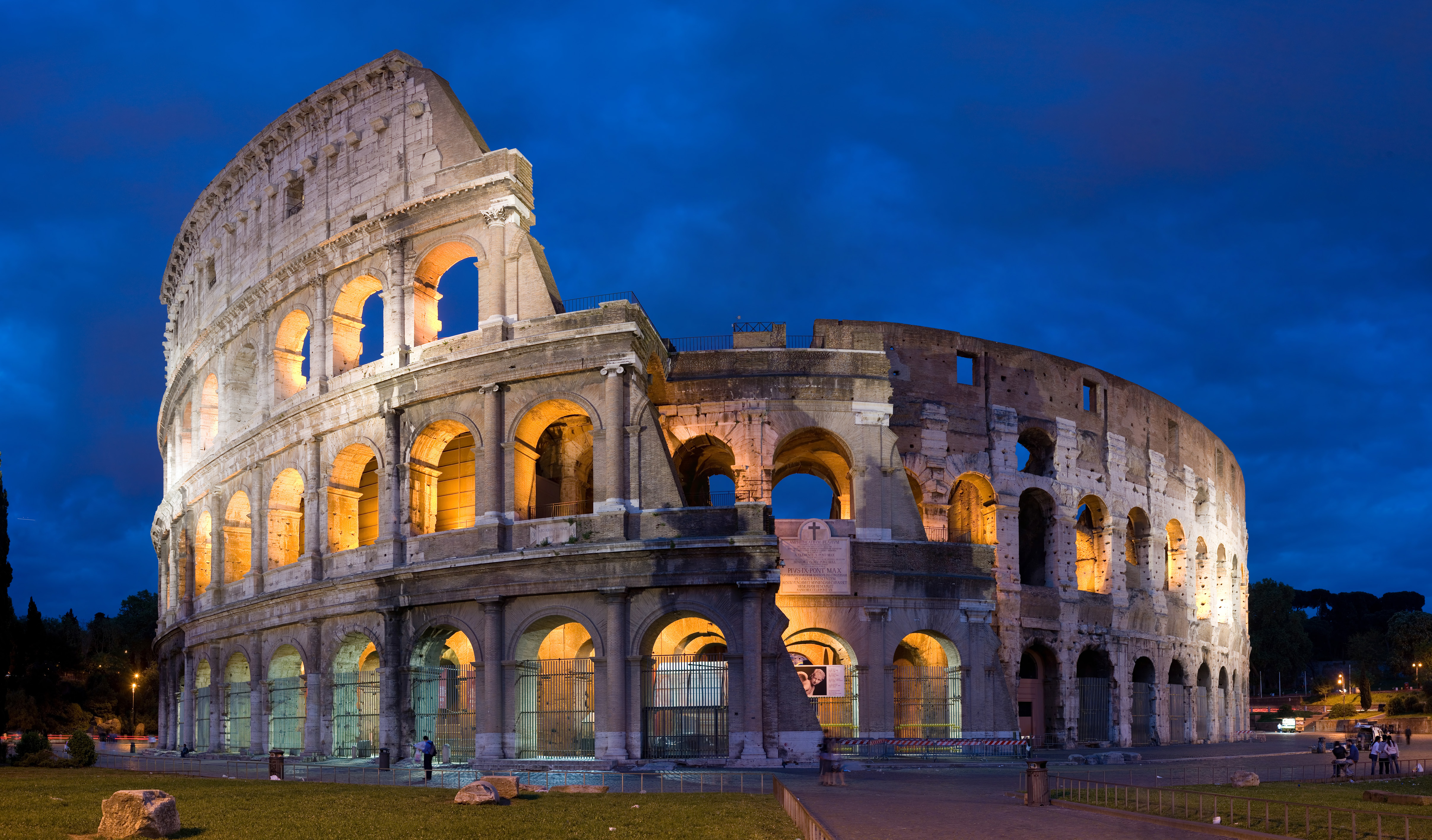
Throughout history, the Greek architectural style has been adopted and revived by many other cultures. The Romans quickly adopted the Greek architectural style (really, they borrowed tons of their artistic ideas from the Greeks), and the term "Classical style" can refer to either Greek or Roman art. However, Romans put a twist to Greek design by sometimes using a superimposed order on buildings which had more than one story - each of the successive stories are decorated with a different order (this is a deviation from the Greeks, who consistently would use one order throughout a whole building). For example, you can see a superimposed order on the outside of the Colosseum (Rome, 70-80 AD). The Doric order is on the bottom level, the Ionic is on the middle level, and the Corinthian is on the top:

You can also see another drawing of the Colosseum orders here
(Note: the fourth level of the Colosseum also is decorated with Corinthian capitals - but these capitals are atop pilasters instead of columns).

The Greek/Classical style has been revived many other times throughout history. Due to the excavation/discovery of Pompeii in 1748, Europeans became enamored with the Classical style once again - which led to the popular Neoclassical movement. Neoclassical architecture can be seen all over America and Europe. In America, the classical style is often used for civic buildings (which makes sense, because the Founding Fathers took part in this Neoclassical revival - they were influenced by the ideal of the Roman Republic). Here are a couple of Neoclassical examples:

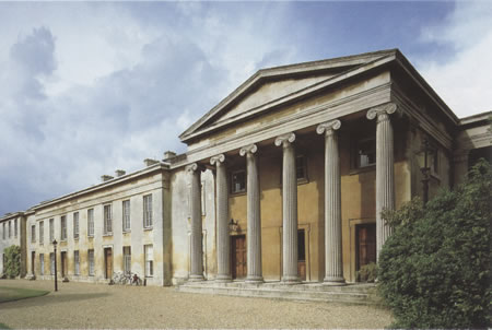
William Wilkins (architect), Downing College, Cambridge (1807-21)
Note the large Ionic columns that decorate the porch

Thomas Jefferson, Monticello, Charlottesville, Virginia (1770-1806)
Jefferson used Doric columns for the porch of his home

Jacques-Germain Soufflot, the Panthéon (Ste.-Geneviève),
Paris, 1755-1792
See the large Corinthian columns?

So, where have you most recently seen some columns with Doric, Ionic, or Corinthian capitals? I most recently saw Corinthian columns on this iron pergola:

Pergola, Historic Pioneer Square, Seattle (first built 1909)

Tuesday, August 25, 2009

Paul Revere as Artist

Paul Revere, The Bloody Massacre, n.d.

I watched the first episode of the John Adams miniseries last night. The beginning of the episode revolves around the Boston Massacre, and at one point, John Adams briefly holds a print which depicts the massacre (shown above). My husband mentioned that he thought the patriot Paul Revere was the engraver of the print. I had never heard before that Paul Revere was an engraver, but my husband was right. Both the The National Gallery of Art and Smithsonian American Art Museum (SAAM) own copies of this engraving (see here and here).1

Actually, Paul Revere made many engravings. Many of them were political, and some were just decorative. Here is are two other engravings by Revere:
Paul Revere, The Able Doctor, or America Swallowing the Bitter Draught. (Royal American Magazine, June 1774; National Archives)

Paul Revere, William Wetmore Bookplate, n.d. (Smithsonian American Art Museum)

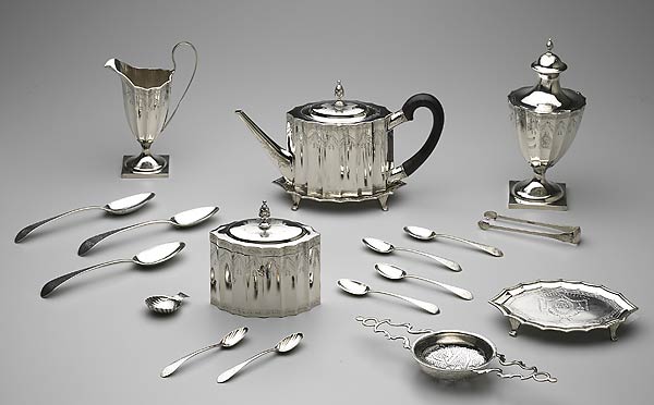
It isn't very surprising that Paul Revere dabbled in engraving, since he was a silversmith by profession. (It's always funny for me to think that Paul Revere actually had a day job - I always associate him with his infamous horse ride, not normal day-to-day life.) Here are some examples of Revere's handiwork in silver:

Paul Revere, Tea Service, 1792-93 (Minneapolis Institute of Arts)

I think one of my favorite silver pieces by Revere are this silver teaspoon and this silver teapot and stand. You can see some of Revere's other engravings and silver pieces in the online collection of the Addison Gallery of American Art.

My final thoughts on Revere as an artist? I think he was a fantastic silversmith, but his engravings are just alright. It appears that Revere wasn't too passionate about engraving; he mostly used the medium for political propaganda.2 I think this lack of artistic passion separates the quality of Revere's engravings from his beautiful silver work. For example, The Bloody Massacre has several problems with linear perspective (look at the orthogonal lines of the buildings) and disproportionate figures.

I don't want to be too harsh, though. Really, Revere's massacre engraving has a quaint, folksy aesthetic. And hey, that's just the kind of art that a patriot should create. It has kind of a "by the people, for the people" feel, right?

1 Paul Revere is often referred to as "Paul Revere II" since his father, Apollos Rivoire, assumed the name Paul Revere upon emigrating to America.


2 See Esther Forbes, Paul Revere and the World He Lived in (New York: Mariner Books, 1999), 110 (available online here).

Thursday, August 20, 2009

Phrygian Caps in Art

Yesterday I was reading about Delacroix's Liberty Leading the People (1831) and started to think about the Phrygian cap that Liberty is wearing. The Phrygian cap is a soft, conical, red cap was traditionally worn in ancient Phrygia (modern day Turkey). In ancient Greek art, these caps were used as headdresses for people from the Orient. Eventually, the Phrygian cap developed into a symbol of freedom and liberty - they were worn by emancipated slaves in ancient Rome. In the eighteenth century, the Phrygian cap became popular with the French revolutionaries and subsequently was known as the "cap of liberty." (The Phrygian cap has even been used as part of the official seal for the United States Senate.) This is a detail of Liberty wearing a Phrygian cap in Delacroix's painting:


This cap made me think of my thesis, in which I argue that Aleijadinho's Prophets (1800-1805) composition is laced with abolitionist sentiment. I briefly mentioned that the clothing of the prophet Amos could allude to abolition (it is possible that Afro-Brazilian capoeiristas wore similar outfits at the time the sculpture was created), but I didn't consider Amos' cap until now:

I wonder if this cap could have been influenced by the Phrygian cap. Part of my thesis ties in these statues to the political/revolutionary sentiment of the day, since these statues were created relatively soon after the 1789 French Revolution. Could Aleijadinho have been influenced by the Phrygian cap of the French revolutionaries? At first glance, it seems to me like Amos' hat might be too long to be a Phrygian cap. I'm curious about looking at my photo archives, though, to see if I can see his cap in better detail. Interestingly, people have written about how the "turbans" of Aleijadinho's Prophets seem to be influenced by Turkish costume (which perhaps could be a connection to Phrygia instead?).

It will be interesting to follow up on this idea and see if it leads anywhere. In the meantime, though, here are a couple of other depictions of Phrygian caps in art:

The Three Magi (Balthasar, Melchior, and Gaspar), mosaic at Sant'Appollinare Nuovo (6th century); Ravenna, Italy
(In this instance, the Phrygian cap indicates the that the wise men are from the Orient, not that they are emancipated slaves!)

Berthel Thorvaldsen, Ganymede Waters Zeus as an Eagle (1817)

Joseph Chinard, The Republic (1794)

Anonymous, Louis XVI of France Wearing a Phrygian Cap, 1792 (Library of Congress)

Tuesday, August 18, 2009

Cezanne = Geometric Man

Camille Pissarro, Portrait of Cezanne, 1874

I just stumbled across this portrait of Cezanne. I'd never seen a portrait of the Cezanne before, but it makes me happy that Pissarro depicted his friend in a bulky, geometric fashion. Actually, it appears that Cezanne was a large-ish man (at least at some point in his life), as evidenced by this self-portrait (c. 1873-1876), this one (c. 1875).*

I like the thought that this bulkier, full-bearded man is reflected in the geometric, bulky art forms that he created. It's almost like Cezanne's geometric forms (like this Mont Saint-Victoire from 1900) are portraits of the artist himself. Ha! I find that kind of cute.

*It appears that Cezanne varied in his physical bulk and size - he appears smaller in this photograph (c. 1861, when Cezanne was about 22 years old) and his face appears quite thin in this self-portrait (c. 1898-1900, when the artist was about 60 years old).

Monday, August 17, 2009

Found Objects and Conceptual Poetry

The idea of taking found objects and creating "ready-made" sculptures began with Marcel Duchamp in 1913 with his Bicycle Wheel. Duchamp's most famous "ready-made" is his Fountain (1917, shown left). It's no surprise that this piece (yep, that's a urinal!) was rejected for exhibition.

I think found object art is really interesting. It's fun to look at an everyday object as art - it gives the object new meaning and interpretation. I also like that found objects often can cause someone to look for aesthetic value and beauty in something that is ordinary. Granted, I don't find a lot of aesthetic beauty in Duchamp's Fountain, but I do like to think about how the sculptural form and physical presence of the urinal parallels sculptures which follow a more Classical tradition. (The white urinal even mimics the white marble of Roman/Renaissance statues! Ha!)

Artists still make pieces from "ready-mades" and found objects. I've already written about the contemporary artist Jean Shin, who uses old castaway objects for her artistic projects. Another interesting artist is Stuart Hayworth. The original prototype for this chandelier on the right (Millenium, 2004) was created out of party poppers that were used for the New Year's celebration for the year 2000. You should look check out Hayworth's other work on his website - he has a lot of interesting, fun, and beautiful stuff.

I like thinking about how other art forms have picked up on the idea of found objects. For example, conceptual poetry (a relatively new trend) takes something that has already been written and reuses the material to generate a new poem. This podcast by the Poetry Foundation discusses how conceptual poetry is similar to Duchamp's idea of "ready-made" art, but poets are about a hundred years behind visual artists when it comes to this artistic trend (listen at 34:44).

For an example of a conceptual poem, listen to the one at about 23:17 on the podcast. This poem was written from words that were used for the September 11, 2001 edition of the New York Times (the edition that was written before the attacks took place that morning). It's interesting to listen to words that are so mundane and ordinary, but also charged and poignant due to the impending disaster.

If you're interested, you can read more about conceptual poetry here.

What do you think of art from found objects? Isn't it interesting that poetry is following this same trend? I love to compare how different artistic ideas develop within various art forms. For example, musicians also latched onto the idea of taking existing sounds and turning them into music - John Cage is probably the quintessential example for this musical trend. (And check out this relatively recent article of a musician that's turning street sounds into music!) Conceptual poetry is a century late in following what visual artists and musicians already have done, but I wonder if Hegel would still view conceptual poetry as part of the Geist of the 20th century. Or maybe not? Perhaps poetry is moving along with its own Geist? :)

Thursday, August 13, 2009

Heidenkind's Art History Reading Challenge

I'm entering in a fun art history reading challenge on the blog Heidenkind's Hideaway. Check it out and sign up too!

The first book I'm going to read fits into the General Studies category: The Challenge of the Avant Garde (edited by Paul Wood). After that, I think I'll read one for the Popular History category: The Genius in the Design: Bernini, Borromini, and the Rivalry that Transformed Rome by Jake Morrissey.

This is going to be fun! I'm excited. There are so many art history books that I have bought and need to read - this challenge may help me to plow through my stack!

Tuesday, August 11, 2009

Parthenon Animated Clip

Earlier this summer I posted about how the Elgin Marbles controversy has been reignited with the opening of the new Acropolis Museum. It seems like the flames keep getting fanned as the summer waxes on. Currently, the Acropolis Museum is showing screenings of a short animated clip by Costa Gavros. This clip shows the history of the Parthenon, which culminates with Lord Elgin's workers hacking metopes and pediment sculptures off of the facade. Excerpts of Lord Byron's poem "The Curse of Minerva" is read by a narrator at the end of the clip (Byron wrote this satiric poem in 1811, when Lord Elgin was still removing marbles off of the Parthenon).

You can bet that this screening is a not-so-subtle hint that the Acropolis Museum wants their sculptures back. You can watch the clip here:


I don't know if this clip has sparked much dialogue between the Greeks and Brits yet, but it has attracted attention and controversy. Recently, the Orthodox Church complained about the depictions of Christians destroying images in the film, and asked that 12 seconds of the film be removed. Later, it was decided that the film would remain unedited.

What do you think of the clip? I think fun to see a visual history of the Parthenon, even if the film agenda is biased.

It will be interesting to see if this Elgin Marbles debate ever ends. I don't think that either side is backing down or willing to reach a consensus as to where the statues should remain. It's a never-ending battle. It kind of reminds me of when Jack Sparrow and Barbossa are locked in an eternal sword fight at the end of Pirates of the Caribbean: The Curse of the Black Pearl. Each side keeps on attacking and jabbing, but no progress is made towards ending the fight.

Friday, August 7, 2009

Intro to Ancient Near East: Akkad

It's been a while since I posted any introductory posts. I thought I'd briefly write about one of my favorite stelae from the ancient Near East period, the Victory Stele of Naram-Sin (shown below, 2254-2218 BC).

The Akkadians were a group of people which took over Sumer in 2334 BC. The Akkadians spoke a Semitic language but used cuneiform (the Sumerian writing system) for their written documents. What I think is most fascinating about the Akkadians is their ideological shift in regards to divine rulers - halfway into the long reign of Naram-Sin (r. 2254-2218 BC), this king decided to heighten his political status by assuming divine status as well.1 There is visual evidence of this ideological shift on the Victory Stele of Naram-Sin, for the king is depicted wearing a horned headdress, a feature which was "formerly the exclusive prerogative of the gods."2

This pink sandstone stele is my favorite piece of Akkadian art. It is one of the first pieces of art to depict an actual historial event; the stele commemorates Naram-Sin's victory over the Lullubi people.

Hierarchy of scale is used in this composition, which means that the most important figure (in this case, Naram-Sin), is shown bigger than anyone else. Naram-Sin is walking up the mountainside, with his smaller soldiers marching behind him. If you look closely, you can see that Naram-Sin is treading on top of two fallen Lullubi soldiers.

The thing I like most about this stele are the stars depicted at the top. There are only two stars shown because the top of the stele is damaged, but it is thought that at least three favorable stars shown on the king. I read a footnote here which mentions that once there may have been seven stars on this stele.

I've had professors posit different ideas about these stars. Some think that the two depicted stars represent the dieties Shamash (the primary diety for the Akkadians) and Ishtar (the goddess of love, marriage, beauty and war). Therefore, the inclusion of these stars could indicate the gods' favorable view of Naram-Sin. It also could be that Naram-Sin is walking up the mountainside in order to make a sacrifice to the gods, thanking them for his victory (which further propagandizes that Naram-Sin has divine support). This theme (the relationship between rulers and diety) is familiar in ancient art, which makes me think that this theory has some creedence. But if there were other stars depicted on this stele, which gods did they represent? How can we ensure that the attribution of gods to stars is not arbitrary?

I've had another professor who wondered if these stars could represent an actual cosmic event that took place during the battle or victory. I think this is a really interesting thought, though I don't believe there is any extant evidence to support this idea. It's kind of fun to think about, though. Since this stele was one of the first pieces of art to depict a historical event, it's fun to think that historical accuracy extended to a depiction of what the stars looked like.

What do you think about these stars? What's your favorite part about this stele?

1 Dominique Collon
, et al. "Mesopotamia." In Grove Art Online. Oxford Art Online, http://www.oxfordartonline.com.erl.lib.byu.edu/subscriber/article/grove/art/T057228pg2, accessed 7 August 2009.

2 Ibid.

Mr. Picassohead

While procrastinating the things that I should be doing, I have been fiddling around with Mr. Picassohead, a fun interactive site where you can create Picassoesque portraits.

Without further ado, I give you my self-portrait:
If you make your own self-portrait with this site, feel free to leave a link to your gallery image in the comments section. It would be fun to see what other readers have made.

Okay. Now back to being responsible...

Tuesday, August 4, 2009

Han van Meegeren


If you thought that the painting above, Woman Reading Music (Rijksmuseum), was by Vermeer, you're mistaken. Don't feel too bad - for a while this painting was thought to be the work of the 17th century master. This webpage points out how the model in this painting is the same one in Vermeer's Woman Reading a Letter; furthermore, this painting is set in the same location as Vermeer's Woman with Lute. In actuality, though, this painting was completed sometime between 1935-40 by the forger Han Van Meegeren.

Van Megeeren was a master forger who spent much of his career making forgeries, particularly in the style of Frans Hals and Johannes Vermeer. Right now I'm reading more about Van Meegeren in the book, The Man Who Made Vermeers by Jonathan Lopez. It's a really interesting book and I highly recommend it. It's really fascinating to read about what forgers do to make their art convincingly old - the paint needs to have a certain chemical compound to imitate old oil paintings, and yet withstand the chemical tests that determine authenticity. Plus, the forgery needs to be created on the canvas of an old painting from about the same period - the forgery is painted on top of the ground layer of the original painting, so that the final product convincingly has the same craquelure. Forgers definitely are clever.

It's no surprise that as a forger, Van Meegeren latched onto the idea of creating paintings by Vermeer. During the latter half of the 19th century, Vermeer was rediscovered and celebrated within the art world. There are only 35 known paintings by Vermeer, which really isn't very many at all (by contrast, it's estimated that Picasso created around 50,000 works of art). Many scholars think that Vermeer did not create many more paintings than the ones that are known today. The last Vermeer paintings to be rediscovered were Woman Holding a Balance (rediscovered in 1911) and Girl with the Red Hat (rediscovered in 1925).1

These last discoveries took place during Van Meegeren's early career, and the art world was desperate to try and find more work by Vermeer. It's amazing to read how hungry museums and collectors were to snatch up "Vermeers" during all this hype - the Boijmans Museum in Rotterdam paid an enormous sum of around 550, 000 guilders for Van Meegeren's forgery of Supper at Emmaus (painted in Vermeer's early style).2 From what I calculated using this site, it looks like that would have amounted to around $4 million in today's currency.

Here are a couple of other forgeries by Han Van Meegeren:

Woman Playing the Lute, ca. 1933 (Rijksmuseum, Amsterdam)

Malle Babbe, in the style of Frans Hals, ca. 1935 (Rijksmuseum, Amsterdam)

Girl with a Blue Bow, ca. 1924 (The Hyde Collection; Glens Falls, New York)


A Young Woman Reading, ca. 1926 (The Metropolitan Museum of Art)

The Lace Maker, ca. 1925 (National Gallery of Art, Washington DC)

If you are interested in looking at more Van Meegeren forgeries, someone is starting to compile a list with images here. You can also read more about Van Meegeren's story and trial here.

So, what do you think of the forgeries? It's interesting to think about how authorship changes the value and reception of a forged work of art. Do you think that these works of art are not as good, now that they have been revealed to be the work of an imposter? Personally, I think that Van Meegeren had a lot of talent. But I think it's sad that he didn't utilize his talent to develop an original style. It takes talent to imitate the masters, but I think it takes more talent to create your own artistic niche.

1 Jonathan Lopez, The Man Who Made Vermeers: Unvarnishing the Legend of Master Forger Han Van Meegeren (New York: Harcourt Books, 2008), 53.

2 Wayne Franits. "Vermeer, Johannes." In Grove Art Online. Oxford Art Online, > accessed 4 August 2009. It should be noted that Lopez' figures are a little different than this entry - Lopez writes that the price was 520,000 guilders, or about £58,000 (See Lopez, 139). Supper at Emmaus was purchased in 1937 by the museum, and its authenticity was not questioned until 1945, when Van Meegeren confessed his forgeries in order to exonerate himself from charges of selling national Dutch masterpieces to the Nazis.